When coming up with the new sections for Clattermouth, the names came pretty easy. Maybe it’s the copywriter in me. I mean, yeah, obviously. That would make sense. But the design? Yikes. I am no visual artist, and I had to wade through many, many iterations of garbage before I settled on some I like.
I fiddled incessantly for days, much to the chagrin of myself and everyone who hasn’t blocked me yet. Because apparently I am a perfectionist. The kind of perfectionist who believes I will eventually arrive at the greatest possible solution, which is the worst kind of perfectionist and also the only kind of perfectionist.
The design for Rogue gave me the most trouble, but it is about rebellion, so I’ll let it slide. I really wanted to make it red because, you know… it just should be red, shouldn’t it? The colour of defiance! However, the universe simply would not let me, as will become apparent. I’m still mad about it, even though I like the pink I ended up using and it actually goes better with the other logos.
Okay, now for the reason you clicked. Don’t deny it. You want to witness my suffering. Here’s a preview, which is approximately 0.27% of the total designs:
I made a bunch of logos that are just other logos that already exist.
This was one of the first ones I made. Look at it. Remind you of anything?
Many thanks to Zach for providing the photo and the mockery.
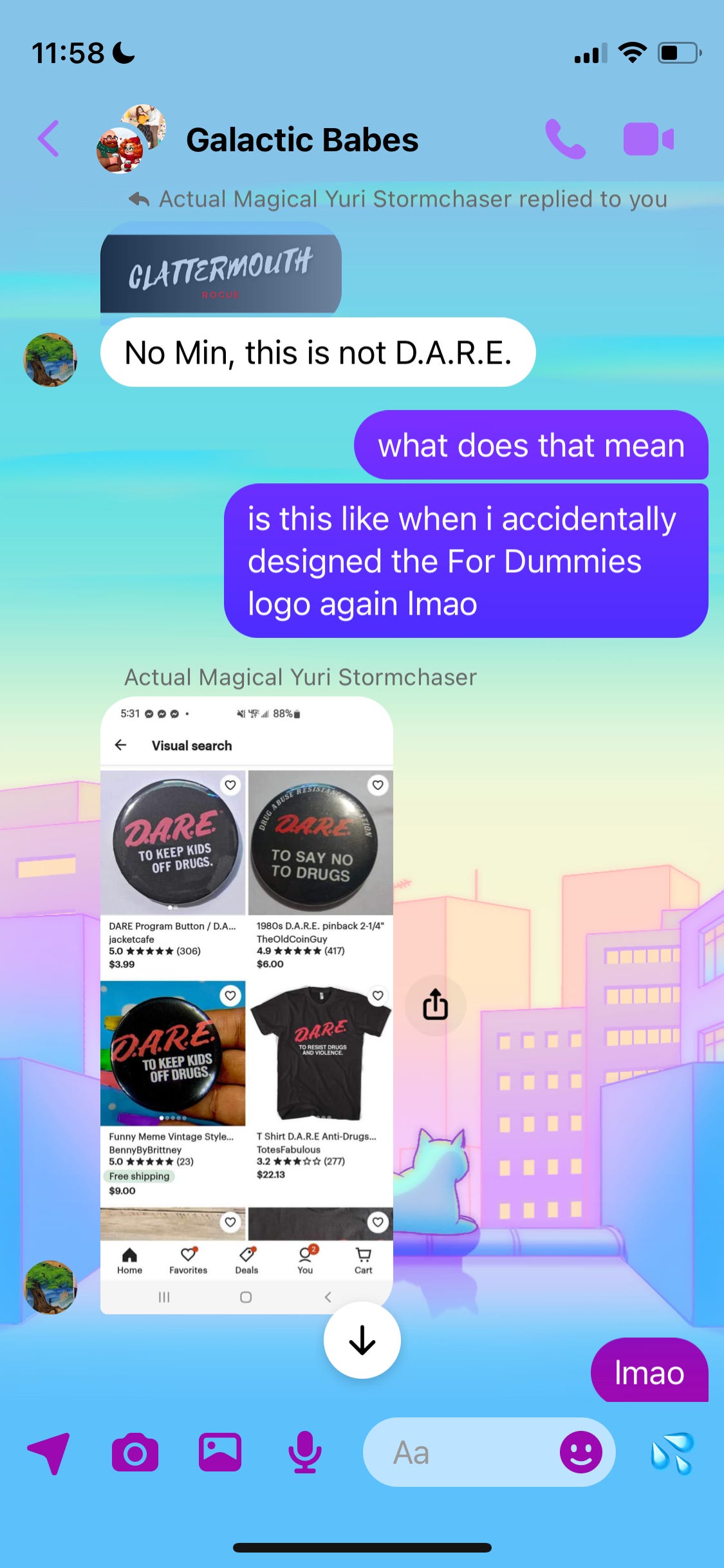
This is an ugly-ass logo. It’s giving bargain-bin James Bond, which is just regular James Bond, if you ask me. And apparently it’s also giving this:
Did we even have D.A.R.E. in the UK? If we did, I blanked it out. Probably because I—
You know what, it doesn’t matter.
This is pretty cool, right? It’s bold and red and shadowy and roguey. I love the colour. I love it! It is arguably the best colour in existence! It’s so sleek! So sexy! So cool!
But I couldn’t shake the vaguely 80s vibe it was giving me, which I didn’t understand because it’s not that different from any of the other logos, and in fact is almost identical to the pink one I ended up using for Rogue.
Yes.
Well.
That’ll be because turning it red also turned it into:
The bloody Baywatch logo. I. Am. Still. Mad. Don’t be surprised when I end up switching to this one out of spite some day.
Clattermouth Rogue is the bane of my life
As you can see, I could not get this one right. I’m still not entirely convinced I have, but my Canva trial expires today so I had to pick something. After struggling through various permutations of reds and pinks and oranges, I ended up with a lot of Valentine’s-looking crap like this:
Hello, yes, do you have a reservation? Lovely. We’ve left the rose petals scattered all over the suite, as requested. Enjoy your stay and please hang up your towels if you can use them again.
Please bring your own towels and take them with you when you leave. I have a blacklight and I’m not afraid to use it.
Welcome to Hell, bitches. It’s HOT and it will BURN YOUR EYES. Okay, I kind of love this one but that could just be because I’m ready for Satan to welcome me into his warm embrace.
Sigh. Let’s just go, shall we?
No, you’re right. Let’s not end this on a bad note. Here’s something I made ages ago when I was thinking about rebranding my copywriting services:
Bye!


